Freelance UI/UX Designer · Taking on new client projects

I design websites your customers come back to.

I'm Syed Mudaseer, a freelance UI/UX designer. Getting a visitor once is the easy part. I design websites, stores and apps that bring them back: clear journeys, fast checkouts and small reasons to return, so one-time buyers become regulars. Since 2023 I've shipped 12 client projects, every one on time.

100% refund if the design doesn't work Fixed price, agreed up front On-time delivery Reply within 24 hours

Suminagashi — move your cursor to stir the ink · click to drop a ring

3+years of freelance product design
12projects shipped, end to end
80%of clients returned or referred me
100%on-time delivery record

Selected work

Two products designed, built and tested in public, my own app and a client store, plus three years of client work, most of it under NDA.

Case study Mobile app · 2025–26 Solo — research → design → build

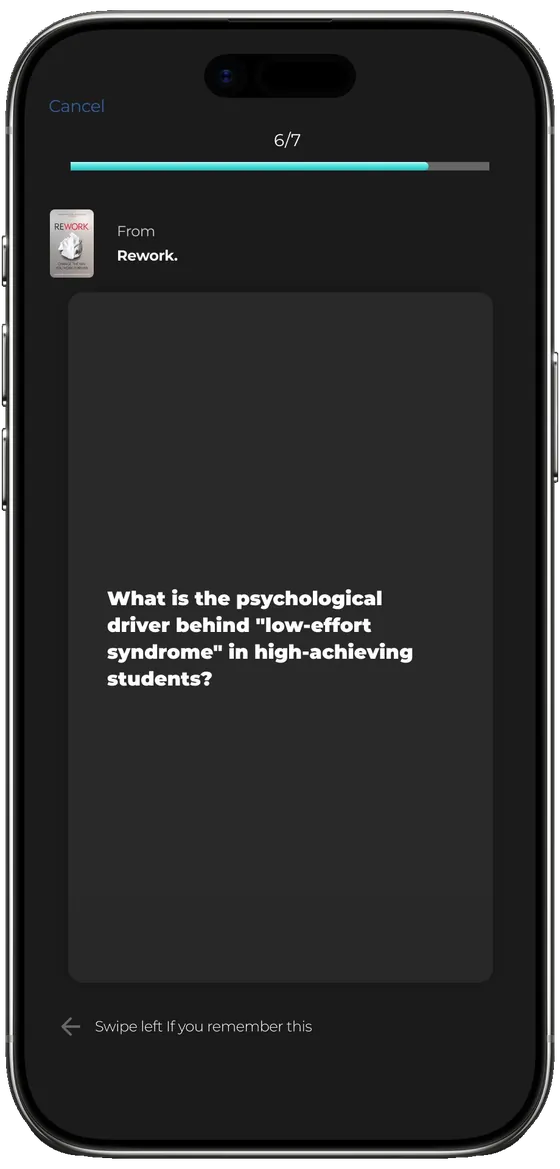
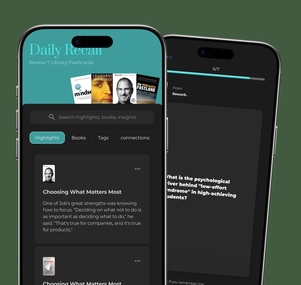
Daily Recall

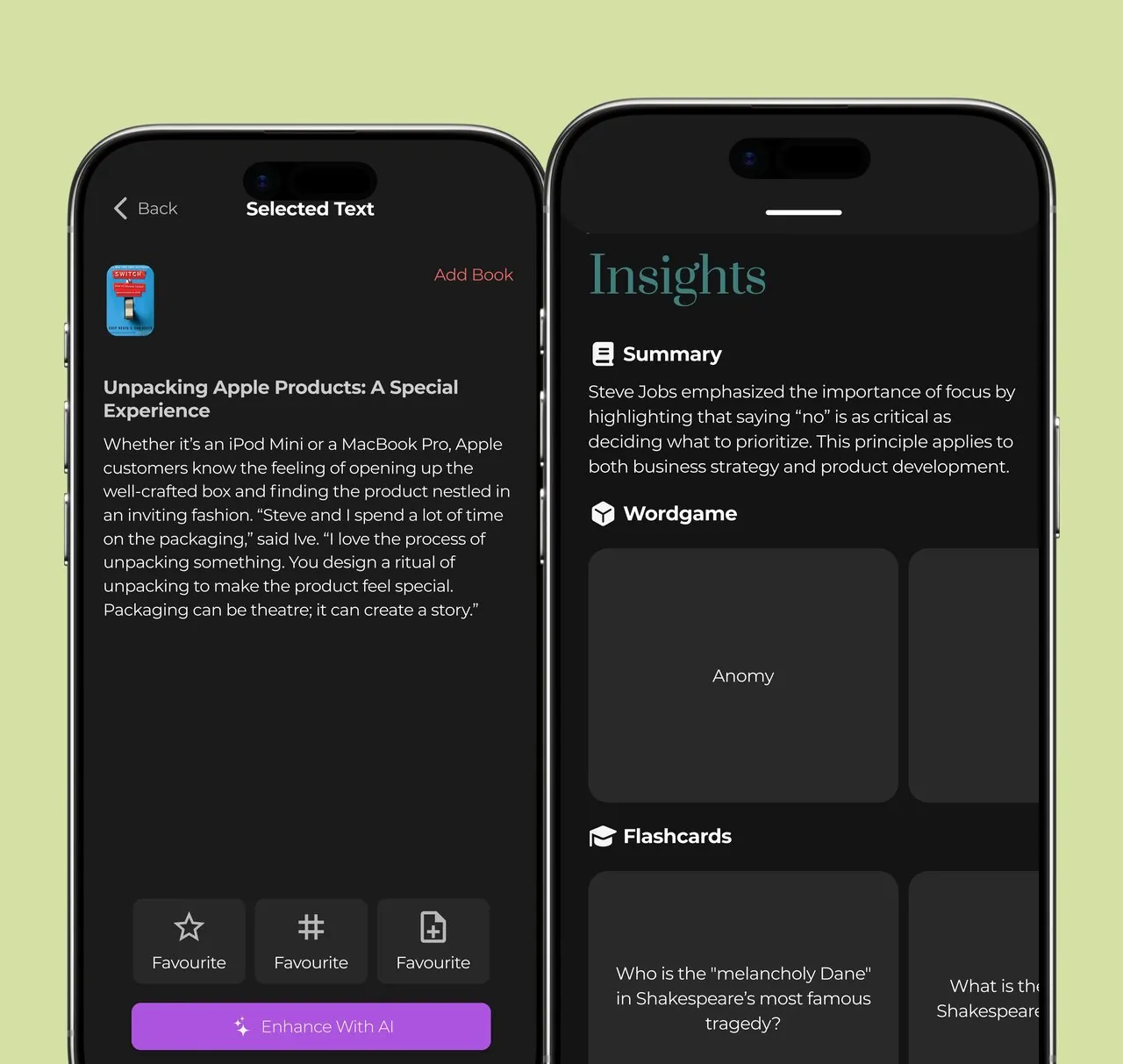
Scan a page you read and the app turns it into a summary, a word game and spaced flashcards — so the idea survives past the highlight.

A reading-retention app for people who highlight everything and remember nothing. I designed the capture → insight → recall loop, then rebuilt it as a working app and tested it on the same people I'd interviewed.
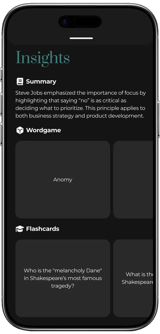
Daily Recall — AI insights screen
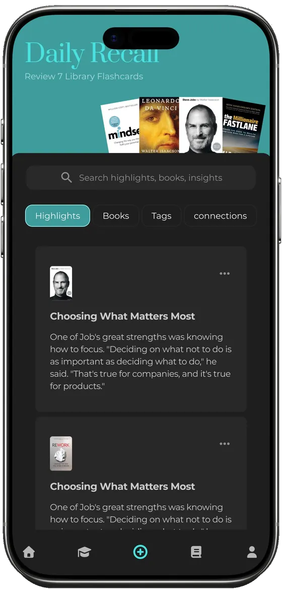
Daily Recall — home screen
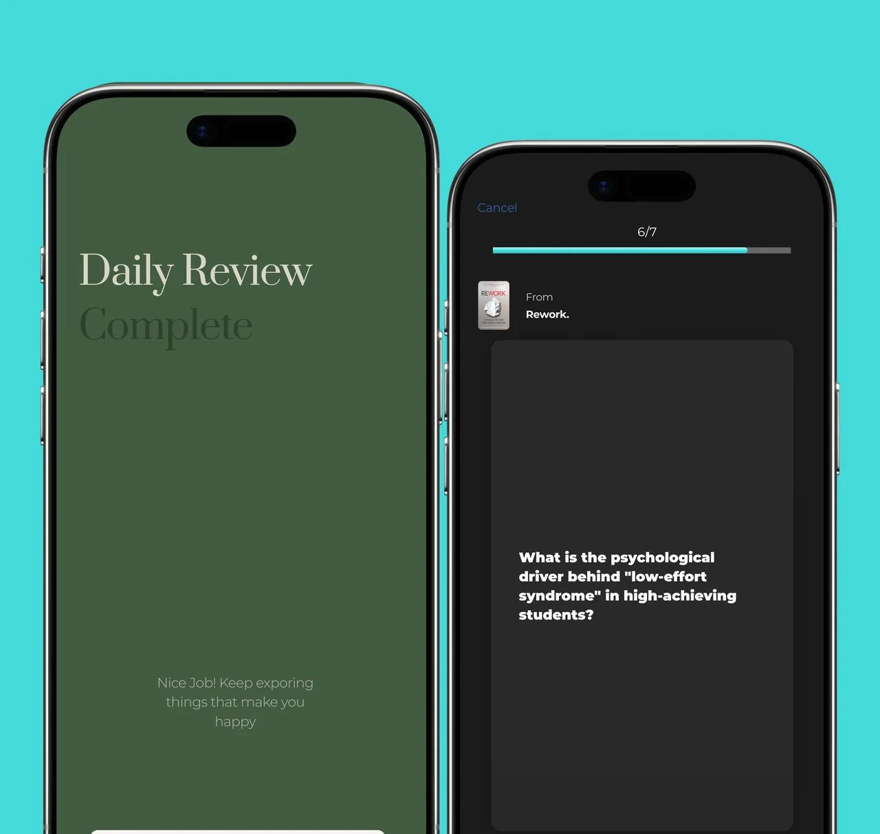
Daily Recall — flashcard review
Case study E-commerce web · 2026 Client project · direction → UX → build

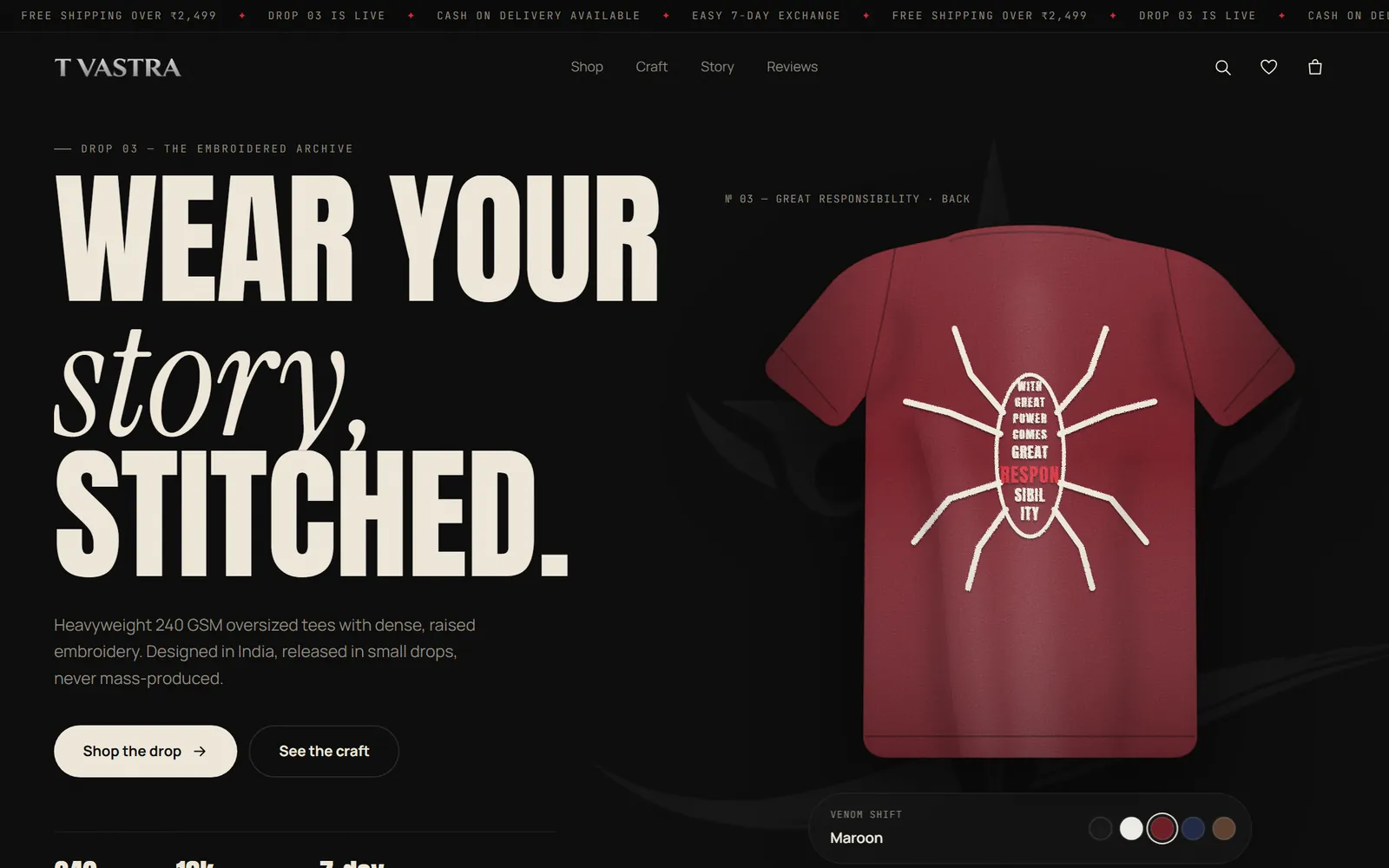
T Vastra

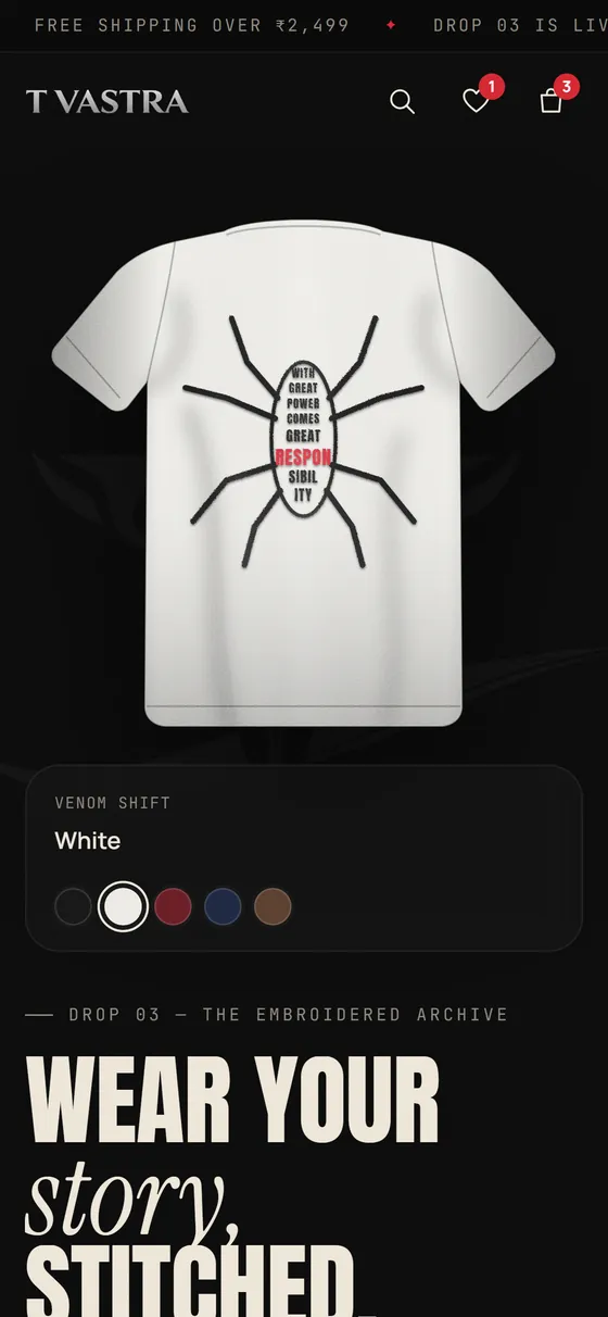
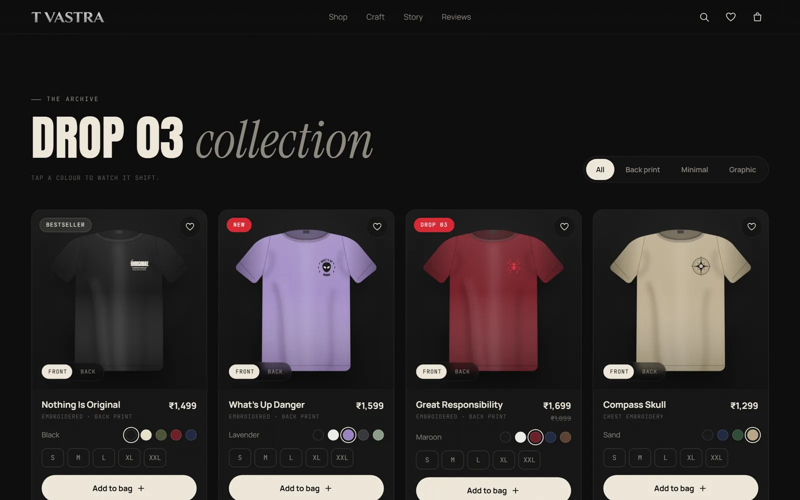
A black, premium storefront for an Indian embroidered-tee label, where picking a colour spreads over the shirt like a symbiote.

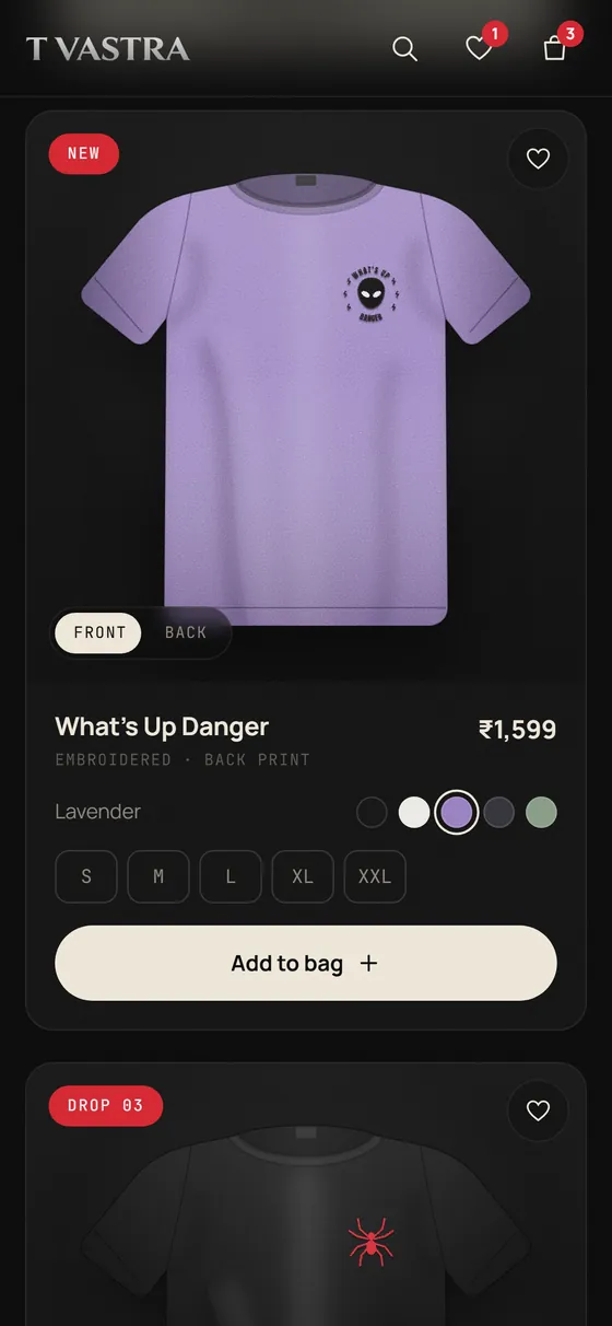
Designed around one signature interaction and a product card where every tap answers back. Shipped as a working store, reviewed by a second AI system and tested in a real browser before handover.

T Vastra on mobile: hero with the colour picker
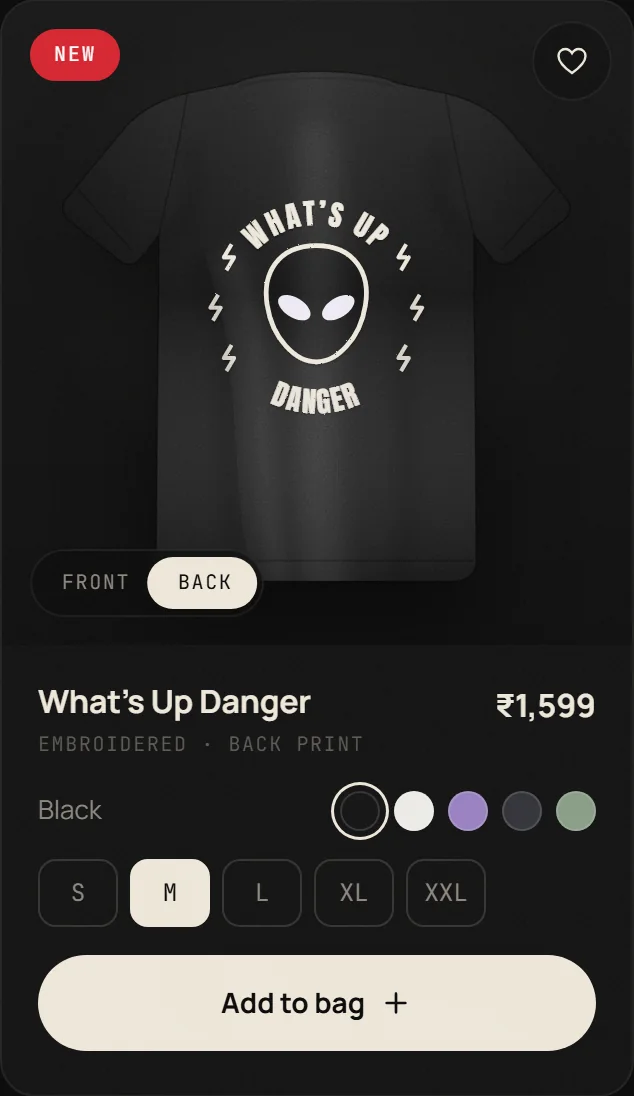
T Vastra on mobile: product card in lavender
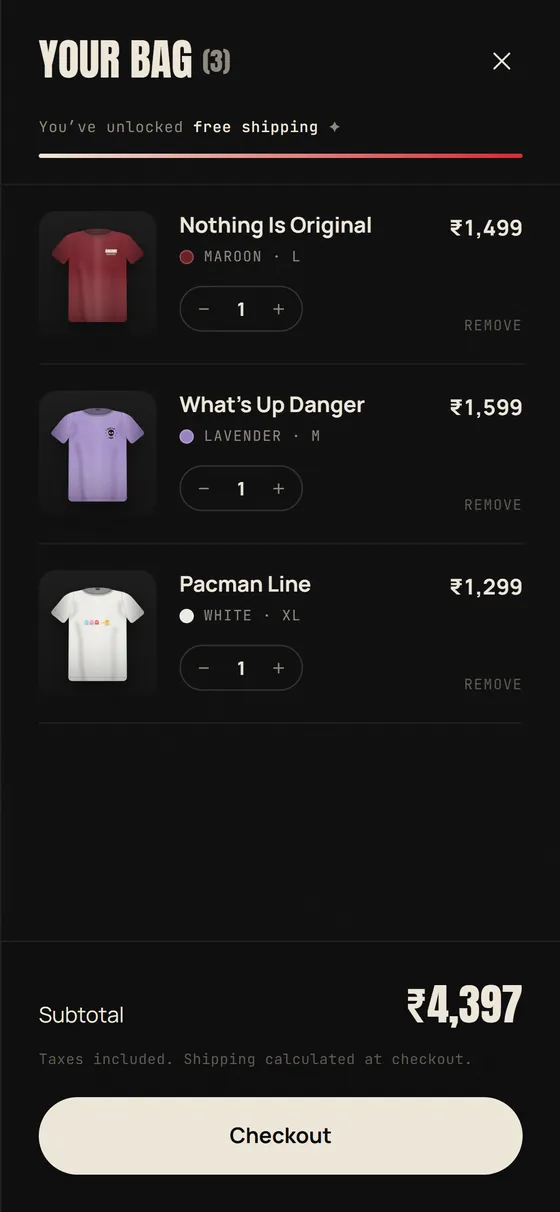
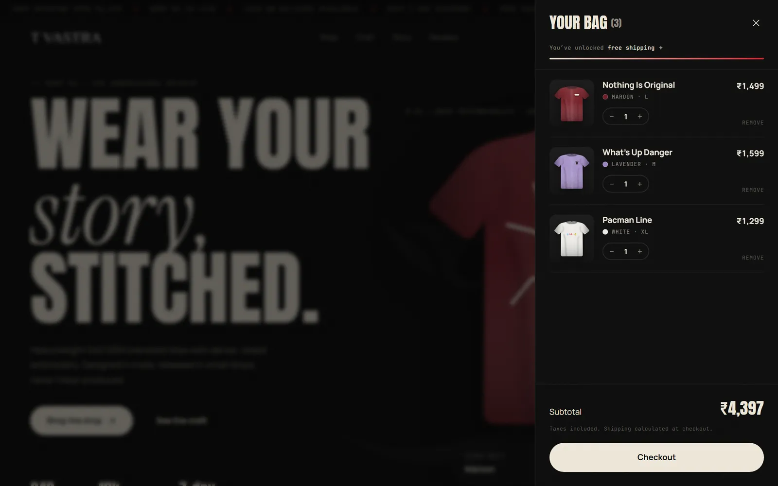
T Vastra on mobile: the bag drawer

Client work (2023–2026). Twelve freelance projects across SaaS dashboards, e-commerce and marketing sites — most protected by NDAs, so they don't live on a public page. A curated client deck with outcomes and references is available on request.

Reading retention 9 user interviews · 2 iteration cycles

Turning a page you read
into something you keep.

Daily Recall scans a page from a book and turns it into a summary, a word game and spaced flashcards — closing the gap between highlighting something and actually remembering it.

▶  Watch the case-study video The full walkthrough on YouTube — the research, the decisions, and the working build in motion.
Daily Recall — home and review screens
壱The signal

A personal annoyance that turned out to be everyone's

It started the way a lot of usable products do — with a problem I was living. My reading habit was leaking; I'd finish a book and keep almost none of it. Before designing anything, I checked whether the pain was mine alone.

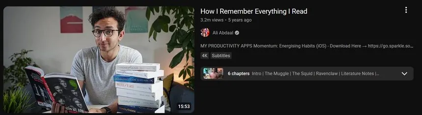
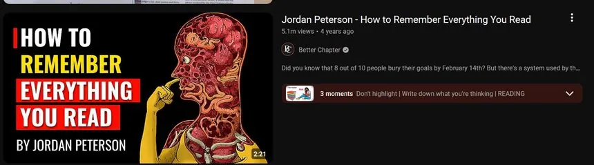
Those view counts weren't opinions — they were a crowd quietly raising their hands. The same question, asked by millions, across unrelated creators. My private frustration was a widespread, under-served need. That was the green light.

Research — the demand was already loud

One question — "how do I remember what I read?" — pulling 17M+ combined views across unrelated channels.

YouTube video: How I Remember Everything I Read
3.2M the question, asked once
YouTube video: How to Remember Everything You Read
9.6M same question, different creator
YouTube video: How to Remember Everything You Read
5.1M and again, and again
弐The incumbent

The existing tool didn't earn the effort it asked for

Someone had tried to solve this — I found Readwise and genuinely wanted it to be the answer. The value was there in theory, but the experience cost more than it returned. Rather than trust my own reaction, I interviewed nine people from the target audience.

The complaints clustered: a flow that felt heavier than the payoff justified. I stopped guessing and documented every friction point users hit as they moved through it. That list became my brief.

参The advantage

I didn't let the design die as a clickable prototype

Instead of handing over a static mockup and waiting, I designed the app and then rebuilt it as a functioning one — not a mockup pretending to work, but something I could put in a hand and watch get used.

That changed my feedback loop entirely. People stopped imagining how a flow would feel and started tapping through it — failing and succeeding at the exact friction points I'd catalogued.

四The iteration

Two full cycles — the surviving version, not a lucky guess

I re-interviewed, redesigned, re-interviewed and redesigned again — two complete cycles, each grounded in watching real behaviour rather than my own taste. The capture flow got simpler; the recall surface got tuned until reviewing felt lighter than the reading it came from.

The final design wasn't my first idea. It was what was left after the weak ones got tested out.

五The takeaway

The pixels were never the job

The design file stayed the source of truth and I stayed the design authority — AI was just a faster brush. The real job was noticing a genuine pain, proving the demand behind it, refusing a tool that didn't deserve its users, and iterating against real reactions until the product fit. That's the same loop I run on client work — and the one I'd bring to your team.

2 cyclesof interview → redesign, grounded in observed behaviour
9 interviewswith the exact audience the incumbent was failing
3-part recallsummary · word game · spaced flashcards from one scan
Client project · e-commerce 12 products · 16 colourways · private demo

A colour change that spreads
like a symbiote.

T Vastra makes embroidered, oversized tees and sells them through Instagram. They wanted a black, premium online store with good type and micro-animations on the product cards. I directed and designed it, then built it as a working store with AI as the brush: Claude Code for the build, OpenAI Codex as an independent reviewer. The venom idea, the critique and every keep-or-cut call were mine.

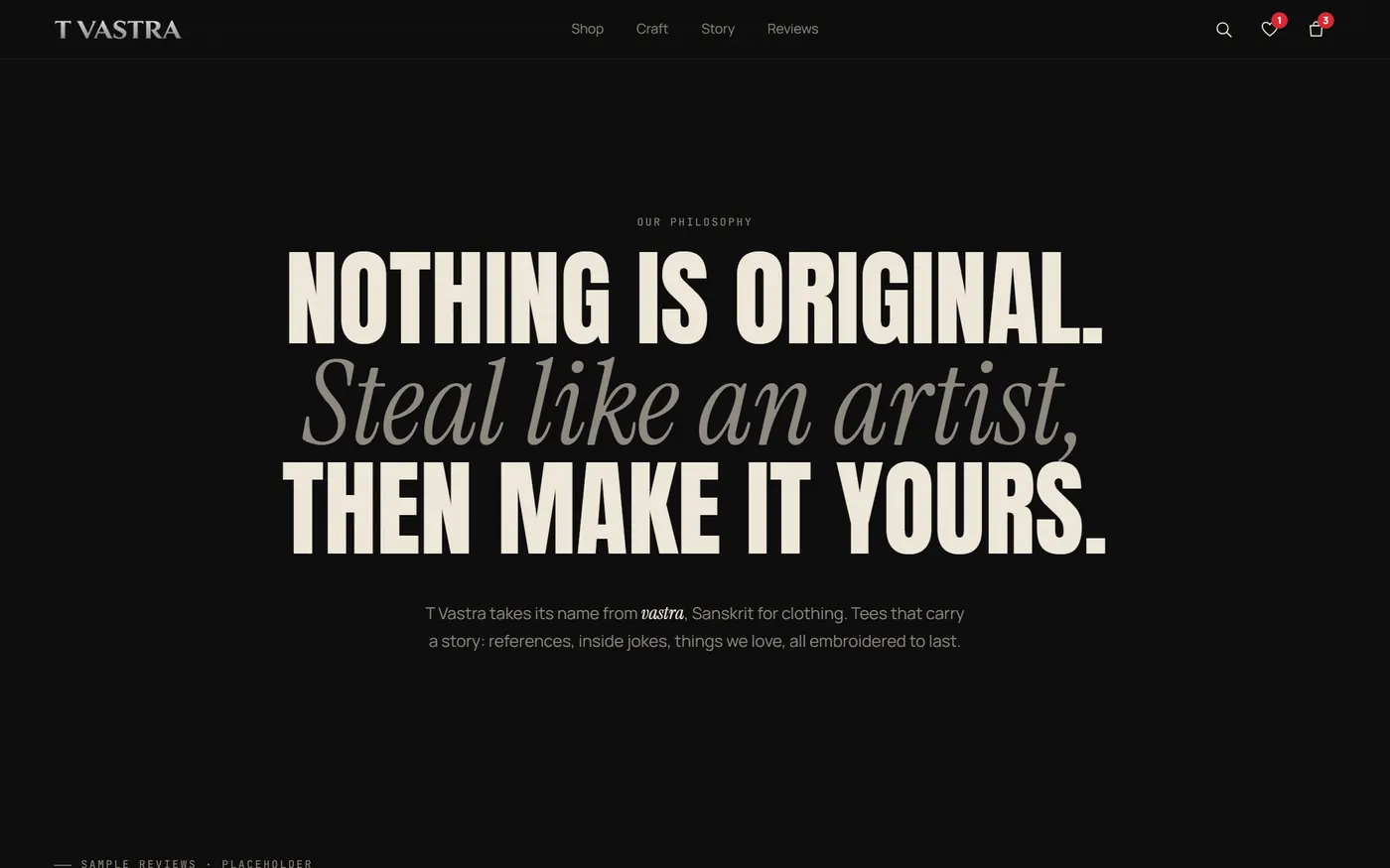
T Vastra landing page: bold type and a maroon tee on a black background with the logo emblem behind it
壱The brief

Black and premium, without looking like a template

The ask was a black, premium store with good fonts and micro-animations on the shopping cards, built on placeholder data so the real catalogue could drop in later.

One constraint shaped everything: the client didn't like their own logo's colours, so the palette couldn't come from it. I built it from the product instead: near-black, a warm bone white, and a single red taken from the thread already in their spider designs.

弐The signature

Picking a colour shouldn't be a swap. It should spread.

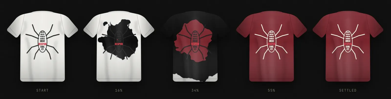
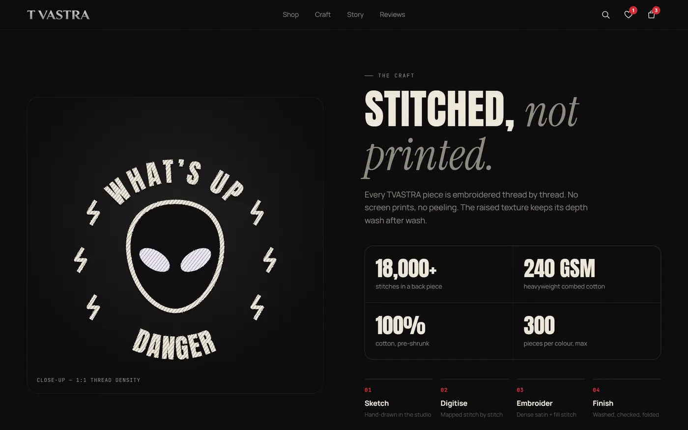
Most stores just replace the photo when you pick a colour. I wanted the change itself to feel like the brand, so I designed what I called the venom effect: a black, tendril-edged layer bleeds out across the shirt, the new colour chases it, and the embroidery re-threads itself halfway through.

That decided how it was built. Photos can't do this, so every tee is drawn as live SVG: the colour is its own layer and the tendrils come from a noise-distorted mask. Twelve designs, sixteen colourways, one renderer. Anyone who has reduced motion turned on gets an instant swap instead.

Five frames of the venom transition: a white tee is covered by spreading black tendrils, then maroon replaces the black and the thread turns light
White → maroon frozen at five points of the 1.4-second transition
参The card

Every tap answers back

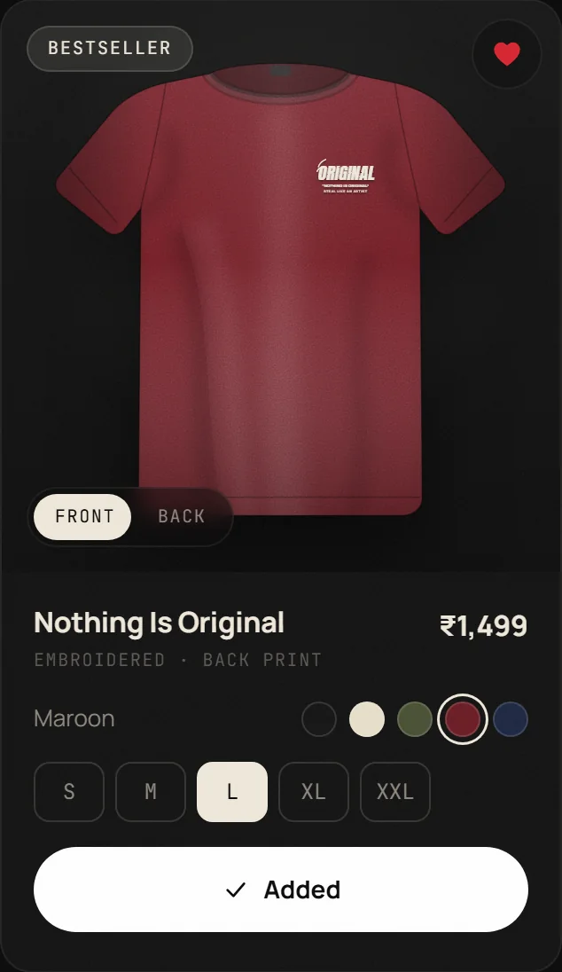
The product card is where people decide, so every action has its own feedback. The colour name slides to the new one, Front / Back flips the shirt in 3D, and Add to bag runs a spinner into a hand-drawn check while a dot in the shirt's colour flies into the bag and the bag icon bounces. The heart bursts when you save a tee.

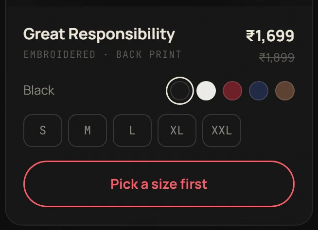
The error state is designed too. Tap Add without a size and the sizes shake while the button itself turns red and says "Pick a size first". That version exists because the first one, a floating label, overlapped the colour swatches. I caught it while taking these screenshots and fixed it before publishing.

Product card in maroon with size L selected, the heart filled and the button showing Added
Picked, saved, added every step shows its state
Product card flipped to show the back embroidery
Front / Back a 3D flip that can change direction mid-turn
Add to bag button in red outline reading Pick a size first
The error lives in the button it shakes the sizes, then resets on its own
四The iteration

The direction I tried, and walked back

After the first build I judged parts of it generic, with too many familiar moves. So I explored a quieter, logo-led direction: a Roman serif matched to the wordmark, square corners, no intro, a centred hero.

Side by side, the bold original sold the product better; the quiet version made the tees feel smaller. I rolled it back but kept what the second pass got right: the client's logo, cut cleanly out of the flat JPG they sent, now in the nav, the intro and the footer and stitched onto a tee in thread colour, plus the emblem as a faint backdrop behind the hero shirt.

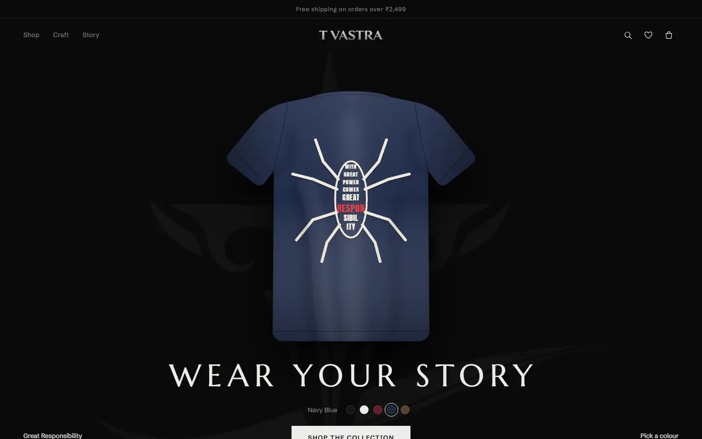
Explored direction: centred navy tee under a spaced Roman-serif headline
Explored editorial and logo-led, but too quiet
Shipped direction: bold headline beside the tee
Shipped bold type, with the logo emblem kept as the backdrop
The client's logo as supplied, on a flat black JPG
As supplied logo baked onto a black JPG
The logo cut out to a transparent PNG, shown on a checkerboard
Cut out transparent, keeping the silver shading
五The handover

A store, not a mockup

It works end to end: the bag survives a page reload, quantities update with a running subtotal, and a bar fills toward free shipping. Before handing it over I put the code through an independent review by a second AI system (OpenAI Codex) and scripted real-browser tests. The first review found four issues and the second found four more. All eight are fixed and the final review came back clean.

Honesty was part of QA too. The placeholder reviews are labelled as samples, and product specs I couldn't verify are flagged for the client to confirm before launch. A demo that pretends to be real is a liability, not a deliverable.

Review — eight bugs caught before the client saw them

Found by Codex across two review rounds, fixed, then re-checked in a scripted Chrome session.

  1. Front/Back flip: a second tap mid-animation was ignored. It now retargets.
  2. Flip retarget: the shirt snapped flat before turning. It now turns from its current angle.
  3. Bag drawer: keyboard focus could leave it. It is now a modal dialog and the page behind is inert.
  4. Toast button: "View bag" stayed reachable behind the open drawer. It is removed while the bag is open.
  5. Closing the bag: focus went back to a button that had disappeared. It now returns to the bag icon.
  6. Fast open/close: a timer could focus the hidden Close button. The timer is cleared on close.
  7. Saved data: a corrupted bag in browser storage could crash the store on load. Every item is now validated.
  8. Duplicate items: two identical saved items became two linked rows. They now merge into one line.
1 signatureinteraction: the venom colour shift, built around live SVG tees
12 × 16products and colourways, with no product photos needed
8 bugscaught by an independent AI review and fixed before handover

Why clients
work with me

Three years of paying clients and real deadlines. You get one designer who owns the whole job, and a guarantee that you only pay for design that works.

One designer, the whole job

Research, UX, UI and developer handoff. For 12 projects I owned every stage, so you don't need to manage an agency or pass files between three people. You talk to the person doing the work.

Deadlines you can plan around

You get a fixed price and a delivery date before any work starts. Every project delivered on time, scoped, estimated and shipped by me, with updates along the way so you're never left guessing.

Built to bring customers back

I design around the return visit: easy re-ordering, saved preferences, clear account pages and follow-ups that feel useful, not pushy. And I practise it myself: 80% of my clients came back or referred me.

Designs your developer can build

A B.Tech in AI & Data Science means I think in constraints. I design what can actually be built, prototype in working code, and hand off clean files, so your developer builds it without guessing.

+32 ptsfaster 5-year revenue growth at design-led companies — McKinsey, The Business Value of Design
5% → 25%+a 5% rise in customer retention lifts profits by 25% to 95% — Bain & Company, Frederick Reichheld
75%of people judge a business's credibility by its website design — Stanford Web Credibility Research

My guarantee:
no risk to you.

Hiring a designer you found online is a leap of faith. So I take the risk instead of you: if my design doesn't work for you, you get a 100% refund. No arguments, no small print.

Before any work starts, we agree on the goal (more repeat orders, more sign-ups, fewer abandoned carts), a fixed price and a delivery date. You see the work at every stage and can steer it. If the final design doesn't meet what we agreed, you don't pay for it.

Customer retention is where the money is. Bain found that keeping just 5% more of your customers can lift profits by 25% to 95%, and McKinsey found design-led companies grow revenue 32 percentage points faster over five years. That's the result I design for.

The way I work

Pain before pixels

I don't design a screen until I can name the specific friction it removes. If I can't, it doesn't earn its place in the build.

Test, then trust

My taste is a hypothesis, not a verdict. I put flows in front of real users early and let what they do — not what they say — settle the argument.

Buildable by design

An engineering background means I think in constraints. I'd rather ship a feasible v1 this sprint than a perfect v3 that never leaves the file.

Then I build and deploy it

No developer? No problem. Once the design is signed off, I vibe code it into a working site with AI-assisted tools and deploy it live for you, so you get one person from first sketch to launch.

FigmaPrototyping User interviewsUsability testing Design systemsInformation architecture Interaction designAI-assisted prototyping WireframingClient & stakeholder management

About

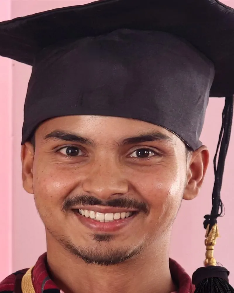
Portrait of Syed Mudaseer Quadri
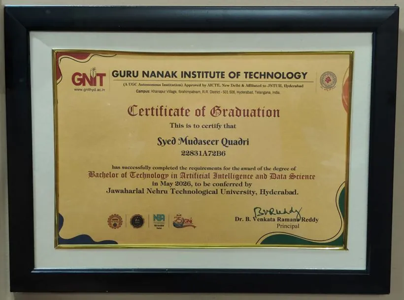
Framed Certificate of Graduation — Bachelor of Technology in Artificial Intelligence and Data Science, JNTUH
The paper behind the fact — B.Tech in AI & Data Science, JNTUH ('26).

I design products people keep using — and I've been paid to do it since 2023.

I'm a freelance product and UI/UX designer working with clients online. For three years I've been the only designer on every project, which means the whole job: research and user flows, hi-fi UI in Figma, marketing creatives, and the design system that keeps all of it consistent.

That range shipped twelve client projects — SaaS dashboards, e-commerce flows, marketing sites — and one product of my own, Daily Recall, taken from nine user interviews through two iteration cycles to a working, user-tested build.

My technical foundation is a B.Tech in Artificial Intelligence & Data Science. It isn't a costume — it's why I'm comfortable in the messy middle where design meets what's actually buildable, and why I design for how your customers really browse: on budget phones, on patchy connections, in a hurry.

What I offer is simple: a website your customers come back to, delivered on time, or your money back.

NameSyed Mudaseer Quadri
Works withClients worldwide · fully remote
Experience3+ yrs, end-to-end product design
EducationB.Tech — AI & Data Science ('26)
ToolsFigma · Framer · AI-assisted workflow
FocusMobile-first, accessible UI
Let's talk

Want a website your customers come back to? Let's talk.

I reply within a day. Tell me about your business and what you want customers to do more often. I'll send back a fixed price and a delivery date, backed by a 100% refund if the design doesn't work for you.

Let’s work together

Three quick fields. I read every message myself and reply within 24 hours.

© 2026 Syed Mudaseer Quadri — designed & built by me Remote · worldwide · 墨 sumi on washi